10 Tips for Designing and Developing Emails
Time to read: 5 minutes
A well-designed email shows that you care about your brand and the communications you send to your customers. It helps foster trust among your recipients, making them more likely to engage with your content and continue to open your emails. We all want beautifully designed emails, right? The only thing standing in our way is how we code them…
HTML email design is considered particularly tricky. This is mainly because Email Service Providers (ESPs) have not kept pace with web browsers making more modern HTML incompatible with some ESPs.
The difference in compatibility between ESPs makes it challenging to design an email that looks great across all providers.
While there is a lot of trial and error involved in email development, it’s helpful to know where to start, along with a few tips and tricks to help you along the way.
- Know your customers. The differences in code compatibility of the ESPs make it very important that you have a strong understanding of how your recipients are viewing your email. Use studies like SendGrid’s 2018 Global Email Benchmark Reportto see which email providers dominate in your industry before you start developing your emails. Or, if you’re using SendGrid, our analytics provide detailed information on email clients, devices, and inbox providers. This information will help you know where to focus your attention in your email design.
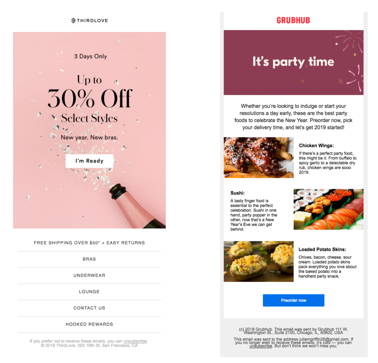
2. Use a single column layout. We recommend sticking to a one-column layout because it’s easier to maintain and more likely to function across platforms. Take a look at the examples below. While the double column format on the right works well when highlighting multiple offerings, the single column format is easier to skim. Neither is better than the other, but you’ll be more easily able to master the formatting of the single-column layout.


3. Use HTML tables for the layout. Instead of using div tags, you’ll want to use table tags. Unfortunately, not all email clients support div tags, so using table tags is the best way to ensure that your email will render correctly across the variety of email clients.
4. Set your width to 600px. With a width of 600 px, your email will fit the size of the screen across all ESPs. Because some email providers (like Outlook) display your email in a side screen to the right of the inbox, there is less space for the actual email. This space is approximately 600 px, making it the safest size to use across email platforms.
5. Double the size of your logo. You want your logo to look crystal clear for users with retina or 4k screens, so save the file at double the size. If you have any other images in your email that are valuable to the send, you can consider doubling the size. However, we don’t recommend increasing the size of all images. If your email is too large, it could take extra time to load, making your recipient quickly lose interest.
6. Inline your CSS. It isn’t recommended to have an external stylesheet because some email providers (including Gmail and Yahoo) view the external sheet as a potential security threat and will block it. Instead, you should inline all styles. In the example below, background color is added to the body by using the style attribute in the same line as the body tag.


7. Style the ALT text. It’s a good idea to use captions for images with ALT text. This way, if your images don’t load, recipients will know the meaning behind the image. You can also go a step further by styling your ALT text so that it’s centered with a specific font size and color. With this additional styling, your recipients can more easily read and understand your message.
8. Use a standard font. While some ESPs (Gmail and Yahoo) accept quite a range of fonts, others like Outlook or AOL do not. There is a set of common fonts installed across all computers and operating systems (such as Arial). You want to choose a common font that is not only similar in style, but also similar in width and line-height. If your brand’s font is narrower than your default font, it could throw off the alignment of the email if an ESP opts for the default font.
9. Add media queries. Media queries allow you to specify different stylistic choices depending on the type of screen your email is being viewed on, helping you create a responsive email for mobile devices. In the example below, the media query is set to a width of 480px (the recommended pixel width for mobile), so that when you open the email on your phone, it is stylized for the mobile experience.


10. Test how your email renders across platforms. It’s important to know how your email will look before it reaches the inbox, and there are a couple of great tools out there to show you how your email renders across platforms. Email on Acid offers unlimited testing across 70+ email providers and devices. Litmus is another great tool for testing how your email renders across a variety of ESPs. Avoid sending a broken email with these tools at your disposal.
Takeaway: Keep it simple
When it comes to email design and development, it’s important to keep it as simple and straightforward as possible. Don’t go crazy with fluid shapes or patterns. Instead, design the email in simple, scannable chunks with the optimal experience in mind.
Ready to get started?
Whether you prefer visual drag-and-drop editing with the ability to tweak code when you need it or would rather code your emails from scratch, you can try building your own email using SendGrid’s Marketing Campaigns tool. Use our free library of over 15 beautiful and customizable email marketing templates as your jumping off point to coding your own emails. If your focus tends to be more on transactional messages, we’ve got you covered too with a repository of Open Source Transactional Email Templates.


Related Posts
Related Resources
Twilio Docs
From APIs to SDKs to sample apps
API reference documentation, SDKs, helper libraries, quickstarts, and tutorials for your language and platform.
Resource Center
The latest ebooks, industry reports, and webinars
Learn from customer engagement experts to improve your own communication.
Ahoy
Twilio's developer community hub
Best practices, code samples, and inspiration to build communications and digital engagement experiences.


