12 Tried-and-True Email List Sign-Up Forms and Tips
Time to read: 8 minutes
A kick-butt email marketing program starts with a rock-solid email list—and email lists start with top-notch sign-up forms. No list, no luck.
But let’s be real—starting a list from scratch is hard work, though it sure beats the damaging effects of buying or renting an email list (the horror!).
Nothing competes with an organic, homegrown list you’ve built from the ground up. These are full of expectant, engaged, and downright valuable recipients who are happy to sign up for your email list. So, how do you get these one-of-a-kind subscribers to consent to you regularly entering their precious inbox? Good question.
Below, you’ll find some of my favorite time-tested email list sign-up form tactics that’ll have subscribers jumping to join your list.
How to create a compelling email sign-up list
Before we get to the different email sign-up list approaches, let’s take a second to catch up on the necessary elements for effective sign-up forms. Without these ingredients, your form will fall flat and underperform—regardless of how strategic you’ve been with the where, when, and how.
- Add value: Your email sign-up form needs to answer the question: “What’s in it for me?” You can’t just ask for an email address—you need to give something first, whether that’s information, convenience, or a coupon.
- Pack a powerful punch in your CTA: Sure, you can ask visitors to “subscribe” or “sign up,” but think about more powerful CTAs like, “Get my free ebook!”, “Join the movement,” or “Yes, count me in!”
- Create clear expectations: Let your subscribers know exactly what’s coming to their inbox. What kind of content will they receive? How often?
- Keep branding consistent: Your sign-up form should be a cohesive part of your brand and the user’s experience. Make sure your fonts, colors, and tone in the sign-up form match the page it lives on.
- Make it simple: Don’t require your potential subscribers to enter their name, hometown, favorite color, and beverage of choice to subscribe to your email list. Keep it simple. Ask for an email address. You can gather more information about your subscribers down the road.
Tips for irresistible email sign-up forms
1. Hit ‘em hard on your homepage


Visit Backlinko.com, and you’ll be smacked in the face straight away with a full-page email list sign-up form.
Most people don’t just stumble upon Backlinko—they visit because they know the owner, Brian Dean, is an SEO guru. Instead of beating around the bush, Brian jumps straight to the point with an impossible-to-miss sign-up form promising “proven SEO and traffic tips.” That’s an SEO enthusiast’s dream come true!
If you’re not a big-name brand with some clout, this in-your-face tactic might not be as effective. But notice how the form is followed by Brian’s big-name customers like Entrepreneur, Forbes, HuffPost, Inc, and even a testimonial from CEO Larry Kim. This establishes social proof for Backlinko.
If you haven’t yet established brand credibility, add some social proof of your own (maybe a customer testimonial or two) to give visitors a reason to share their email address.
2. Offer page-specific add-ons
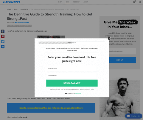

Create sign-up forms that are relevant to the page your visitor is reading. For instance, Legion Athletics offers a full beginner’s guide to weightlifting in the email sign-up form embedded in their intro article to strength training. And on all their supplement research posts, they provide coupon codes for their products in exchange for an email address.
Make sure your sign-up form matches the content you’re serving. You can imagine how alienating it would be if Legion Athletics used a sign-up form promising coupons for their whey protein products in an article about vegan nutrition. Taking the time to tailor the sign-up form will make it more compelling.
3. Wait, there’s more—sign up for our mailing lists
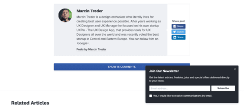

Pretend you’re on a first date. You don’t want to ask for an engagement right away—you need to get to know each other first. Let your visitors enjoy the content they came for, and then make your request.
On Designmodo’s blog, you won’t get hit with the “Join Our Email Newsletter” sign-up form until you’ve read the entire article. At this point, you’ve clearly shown interest in the content, so it makes sense for them to offer to send the latest articles straight to your inbox.
Inversely, pop-up forms that attack you before you’ve even had a chance to read the first sentence are a huge turnoff. Why would your visitors hand over their email address before they even get to know you and what you have to offer?
Be patient. Let them read. Let them engage. After visitors have shown their interest, offer them more.
4. Add an email sign-up form to the sidebar or footer
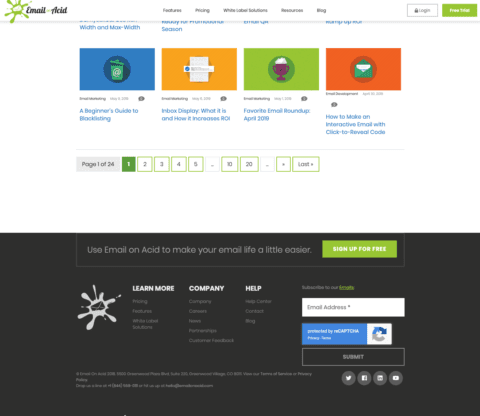

Consider this your passive list-building method. Footer or sidebar sign-up forms are an unobtrusive way to gain email subscribers. You’re not jumping to get in front of visitors—you’re just providing an easy-to-find form for visitors who want to subscribe.
Consider Email on Acid’s footer form. It’s plain and clean—no fluff about it. Any page the visitor is on, they’re able to scroll down and subscribe. Easy as pie.
5. Make it stick


Sticky menus provide a fantastic venue for subtle opt-in forms. A sticky menu is simply a navigation bar on the top or bottom of your screen that stays in the same place even as you scroll up and down the page. These sticky forms are great because they’re not obnoxious or in your face, yet they’re impossible to miss.
Take a look at this example from Pat Flynn of Smart Passive Income. He features his latest podcast episode in a simple media player stuck to the bottom of the window. And sitting inconspicuously in the corner is a smooth suggestion to “Join SPI Newsletter.” If you visit the website, start listening to the podcast, and find you enjoy the content, you’ll be primed to subscribe for more.
6. Expand your sign-ups to social media


Don’t limit your email list sign-up forms to just your website. With social media, you can invite your followers to become subscribers with a variety of techniques.
First, use organic posts to drive traffic to landing pages with lead magnets. Try pinning one of these posts to the top of your profile so it’s the first thing your visitors see. As you probably know, social media is becoming more of a pay-to-play world, so you may have to use some cash to see conversions—that’s where lead ads come in.
On Facebook, you can set up lead ads to make the email sign-up process easy. These forms combine simple CTA buttons with pre-populated forms to help you convert on desktop and mobile. With just a few taps, viewers get the information they need, and you get an excellent new member to your email list. It’s a win-win.
7. Take your form offline
Woah. Radical, right? This technique might seem old school, but hear me out.
With the world going digital, a physical email list sign-up form can stand out. If you have a brick-and-mortar business, you could place sign-up forms at the register or even on the dining table. If you have a booth at a conference, festival, or other events, keep a sign-up form handy for interested passersby and customers.
8. Ask your registrants
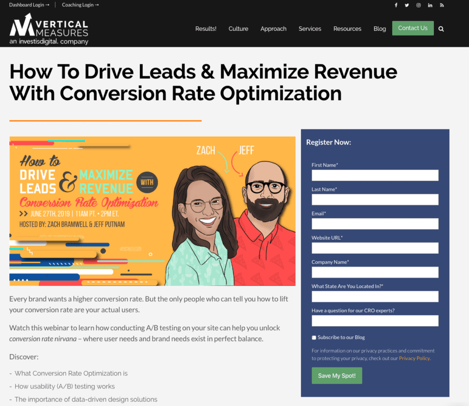

When visitors register for a webinar, demo, or event, ask if they want to sign up for your mailing list. They’re already providing their email to receive notifications and information regarding the event, so it’s a natural follow-up request.
Take Vertical Measures’ webinar series, for example. At the bottom of the registration form, they provide an easy way to subscribe to their blog with a simple checkbox. If registrants aren’t interested at first, don’t fret. Make the ask again when you send post-webinar emails.
If you knocked it out of the park with the webinar, there’s a good chance participants will be interested in receiving more of your content.
9. Provide an SMS sign-up option
Make it easy for recipients to join your email list by trying a text-to-join option. If you’re hosting a conference or event, let attendees know they can receive your emails by texting “Sign up” and their email address to a specific number. Texting a few words to a phone number is a lot easier than visiting a landing page and signing up via a form.
10. Mind your “please” and “thank you”
Take advantage of your thank you pages and form submissions by asking visitors to subscribe. If a customer just purchased a product or service they’re super excited about, offering up-to-date news and future coupons could entice them to join your list.
11. Sharing is caring… and rewarding
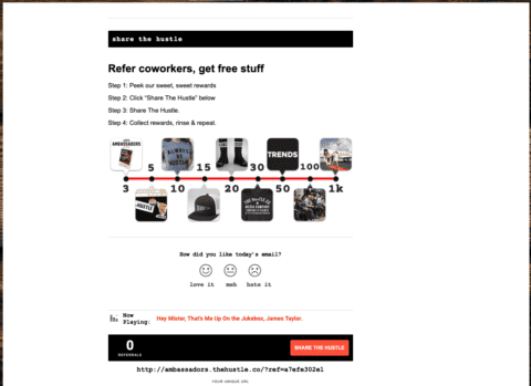

This isn’t a sign-up form per se, but it’s an incredible method for growing an engaged list.
Get your recipients to help. The Hustle does this well with their referral program. In every email The Hustle sends, you’ll see a “Share the Hustle” section at the bottom that explains the program in a nutshell—you share a link, your friends sign up, and you get sweet branded rewards like t-shirts, socks, subscriptions, and more.
It’s simple, but oh-so-powerful. Powerful enough to grow The Hustle’s mailing list to more than 1 million subscribers.
12. Make the most of your 404 page
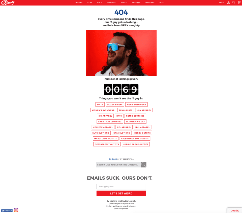

Turn your lost visitors into loyal subscribers by optimizing your 404 pages. How? Let Shinesty give you a little inspiration. Their 404 page is witty, helpful, and exploits the innocent navigation mistake.
At the bottom of the page, they have the heading “Emails Suck. Ours Don’t,” followed by a simple sign-up form with a fun CTA, “Let’s Get Weird”. This 404 page is chock-full of top-notch copywriting that surely converts a handful of subscribers who might otherwise have become disgruntled visitors lost in cyberspace.
Grow your email list with Twilio SendGrid
Your mailing list sign-up forms shouldn’t be a one-and-done task. Experiment, assess, and adjust. Try using a combination of these techniques to see what resonates with your visitors. One of these methods may help you strike sign-up gold, or it may just be a good place to start as you come up with your own original sign-up form ideas.
Whichever tactic you choose to try, Twilio SendGrid can help you grow your list with simple sign-up forms. You can embed these on your website, or we’ll host a landing page for you that you can link to. Plus, our sign-up forms use reCAPTCHA so you know the email addresses you get are legit.
Once you get your forms up and running, you’ll have a pipeline of subscribers joining your email list. But gathering email addresses is just the beginning—now it’s time to deliver valuable emails to nurture and convert these lucky recipients. To take your program to the next level, check out our guide How To Grow Your Email Marketing List. It’s jam-packed with great tips to grow your email marketing list and keep your subscribers engaged.


Related Posts
Related Resources
Twilio Docs
From APIs to SDKs to sample apps
API reference documentation, SDKs, helper libraries, quickstarts, and tutorials for your language and platform.
Resource Center
The latest ebooks, industry reports, and webinars
Learn from customer engagement experts to improve your own communication.
Ahoy
Twilio's developer community hub
Best practices, code samples, and inspiration to build communications and digital engagement experiences.


