Complete Guide to Email Marketing Landing Pages
Time to read: 7 minutes
Email Marketing Landing Pages
If email’s the baited hook, the email capture landing page is the sturdy and trustworthy line that allows you to reel in prospects to complete a desired action—e.g., completing a sale, downloading an ebook, requesting a demo, subscribing to a newsletter, or something else. A catchy headline and a juicy offer may be enough to entice the email recipient, but moving from interest to action isn’t always a given. Done right, adding a landing page to an email marketing strategy can alleviate concerns, answer questions, and provide extra depth to inspire customer confidence.
What is an email marketing landing page?
Simply put, an email marketing landing page whisks prospects from their email inboxes to a distilled-down homepage. Linking from email to landing page allows you to keep email copy minimalist and invite interested prospects to learn more and take action on a beautiful page streamlined to engage.
Email marketing sequences include dedicated landing pages to build trust and nurture relationships by:
- Welcoming subscribers to make a favorable first impression
- Segmenting audiences by interest to deliver more relevant future emails
- Sending customized recommendations and offers
- Delivering information to overcome common obstacles to purchase or next steps
- Recovering subscribers who abandoned their shopping carts or who haven’t engaged in a while
At a glance, email prospects understand what you want them to do and what value your business provides. Like a newsletter landing page, you can segment email offer pages by audience, campaign, or marketing objective.
How to use an email marketing landing page
Use landing pages to encourage any number of actions, notably:
- Newsletter sign-ups
- Ecommerce shopping
- White paper downloads
- Webinar registrations
- Job applications
- Survey completion
- Demo or consultation scheduling
- Coupon offer redemptions
Whether you launch a new product or create a more personalized sales funnel, email campaigns and landing pages seamlessly pair to supercharge conversions.
Email landing page best practices
There’s room for all brands to optimize. Proof in point: the average email landing page converts at a rate of 2.35%, but the top 25% of sites convert at 5.31%, with the top 10% converting at 11.45% and up. Consider these email landing pages best practices to create higher-converting campaigns.
1. Write a standout headline.
A landing page headline communicates clear, concise value. With the average visitor bouncing off within seconds of arriving, your headline’s chief objective is to convince people that staying is worth their time. Your headline should make a simple yet compelling first impression.
Great email landing page headlines:
- Match the message to the email campaign
- Prioritize clarity above all else
- Sell a benefit
- Solve a problem
- Provide a unique, compelling hook
2. Align the page with your overall website design.
Strong landing page design provides continuity and solidifies trust. Before email subscribers act, they must feel confident they’ve made a wise decision by following the link. They want to know they are closer to reaching the desired offer and didn’t click on spam by mistake.
The email marketing message and landing page should contain matching:
- Color schemes
- Fonts
- Imagery
- Value propositions
- Offers and/or actions
3. Bring on the big, bold (and fast-loading) graphics.
Email providers often limit the size of graphic attachments. By contrast, landing pages offer a world of possibility, from video to oversized graphics to parallax-style scrolling. Keep in mind that customers are 80% more likely to read marketing content when it’s interspersed with colorful graphics. At the same time, bounce rates decrease 32% from a 3 to 1 second in loading time, so it’s best to prioritize speed and simplicity over elaborate design.
The best graphics are:
- Real, genuine, and relatable—not generic stock photos
- Large, filling up the above-the-fold area
- Appealing, extolling the emotional value of your product or service
- Directional, pointing visitors to a nearby block of text or call-to-action (CTA) button
- Trust-building, including badges, icons, testimonials, or awards
4. Include strategic internal linking
An email landing page is the appropriate tactic for next-level information sharing and credibility building. But only insert links to relevant internal pages—rather than filling the main landing page with excessive copy. You want clicks, since web users who click at least 2 links are more likely to convert to a sale.
Consider inserting links to the:
- About page
- Contact page
- Privacy statement
- Social media pages
- Homepage (via the logo)
5. Put your desired action above the fold—and make it stand out.
The CTA is the most important element on your landing page as it’s the most direct path to the desired outcome. Be clear about what you want visitors to do now that they’ve come to your page. Rather than designing a default CTA, consider using data to craft personalized CTAs, which perform up to 202% better.
The best CTAs also:
- Appear above the fold in an unmissable location
- Use power phrases like “get it now,” “treat yourself today,” or “subscribe and save”
- Take the shape of boldly colored buttons in a familiar square, rectangle, or circle
- Easily attract the eye with arrows, animations, or graphic cues
- Are completed quickly, with as little information or as few clicks as possible
6. Use social proof to tell a story.
Humans like social proof—which is why over a third of top landing pages use testimonials to build trust. Increasingly, brands appeal to new customers by providing reviews from past purchasers that validate the offer. You might think of this section as a “humble brag.”
Email landing page social proof may include:
- Star ratings and testimonials from real customers or companies you’ve worked with
- Myth-busting quotes from reviews that alleviate common concerns
- Media mentions from trusted sources or awards you’ve won
- Results-based case studies or statistics
- User-generated content, photos, videos, icons, or other visuals
7. Use templates and test to perfection.
There’s no need to reinvent the wheel. A conversion-focused template customized to your brand offers an easy way to debut a professional design without spending excess time or budget. Like a Lay’s potato chip, why stop at one? Grab a handful of landing page templates and see which ones perform the best.
We recommend A/B testing the following elements, one at a time:
- Headline wording
- Graphics and layout
- CTA offers
- Testimonials
- Color scheme
Testing and retargeting your landing pages can increase conversion rates by up to 300%, so it’s worth the extra effort—like adding dip to your chip.
Email marketing landing page examples
Now that you know the basic elements for a fantastic landing page, let’s move on to a few concrete examples that show precisely how all these theories work in practice.
Stitch Fix
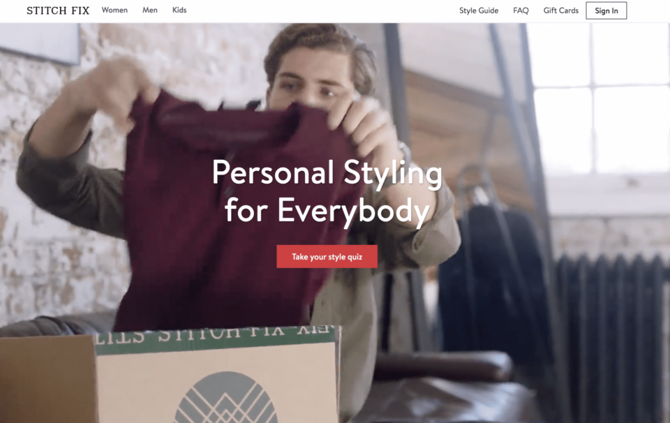

What you can steal:
- Fun CTA: Everybody loves taking a quiz—plus, it’s a path to greater personalization.
- Feel-good appeal: “Personal styling for everybody.” Need we say more?
- Segmenting: Access the looks that appeal to you, whether man, woman, or child.
- In-depth content: The Style Guide is bound to provide a deep dive into style if you crave it.
- Links: The FAQ answers potential objections, while gift cards offer another desired action to increase sales.
Rover
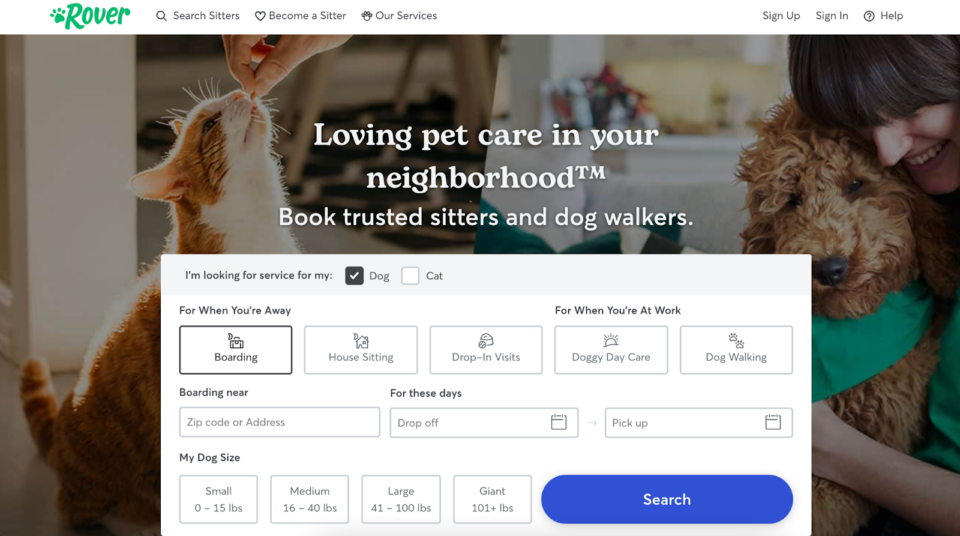

What you can steal:
- Trustworthiness: Below the fold, the page contains testimonials, guarantee details, and 24/7 support.
- Short form: After just a few personalized questions, visitors can access the information they need.
- Confidence-inspiring imagery: Everyone is smiling on this page, four-legged friends included.
- Clear headline: “Trusted sitters” and “dog walkers”—there’s no ambiguity about what the site offers.
- Easy navigation: This page serves new and existing customers and prospective sitters with ease.
Lyft
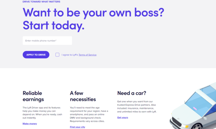

What you can steal:
- Attention-grabbing headline: “Want to be your own boss?” Sounds good. Continue.
- Easy CTA: “Apply to drive” only makes prospects want the offer more, given the competition.
- Segmenting: “Find your city” helps narrow down requirements and personalize future content.
- Illustrations: The illustration provides a sleek, professional look, contrasting the photos on the other pages.
- Color scheme: All the CTAs are purple, so it’s easy to see where to act.
Women in the Food Industry
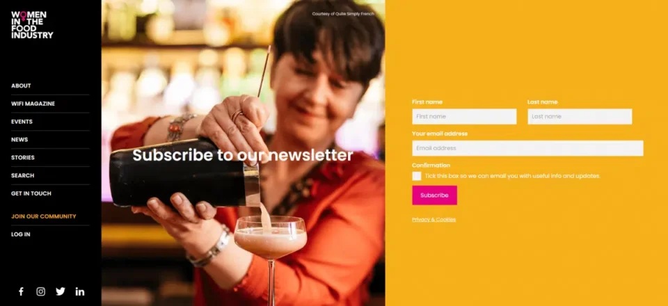

What you can steal:
- Genuine photo: The photo background reminds you that you’re joining a community of real people.
- Colors: The warm, inviting colors complement one another well and create a definite vibe.
- Standout CTA: There’s no missing the bright magenta Subscribe button, even on a vivid backdrop.
- Ample links: The menu invites guests to visit social, “join” the community, or click to Get in touch.
- Social proof: Logos showcase supporters to build trust and make it seem like everyone’s doing it.
Kabbage
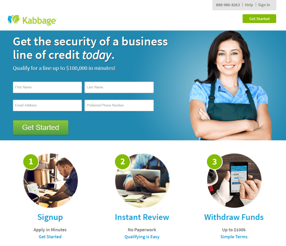

What you can steal:
- Visual process: The 1-2-3 graphics make it appear easy to get started with the service.
- Benefit headline: “Get the security … today” conveys immediate benefit to the visitor.
- Specificity: Reiterating “up to $100,000” in 2 locations emphasizes the value—especially for a reader that might have missed it the first time.
- Easy contact: Visitors can fill out the form quickly or simply call the number at the top of the screen.
- Complementary colors: The blue and green from the image to the text provides pleasing continuity.
HelloFresh
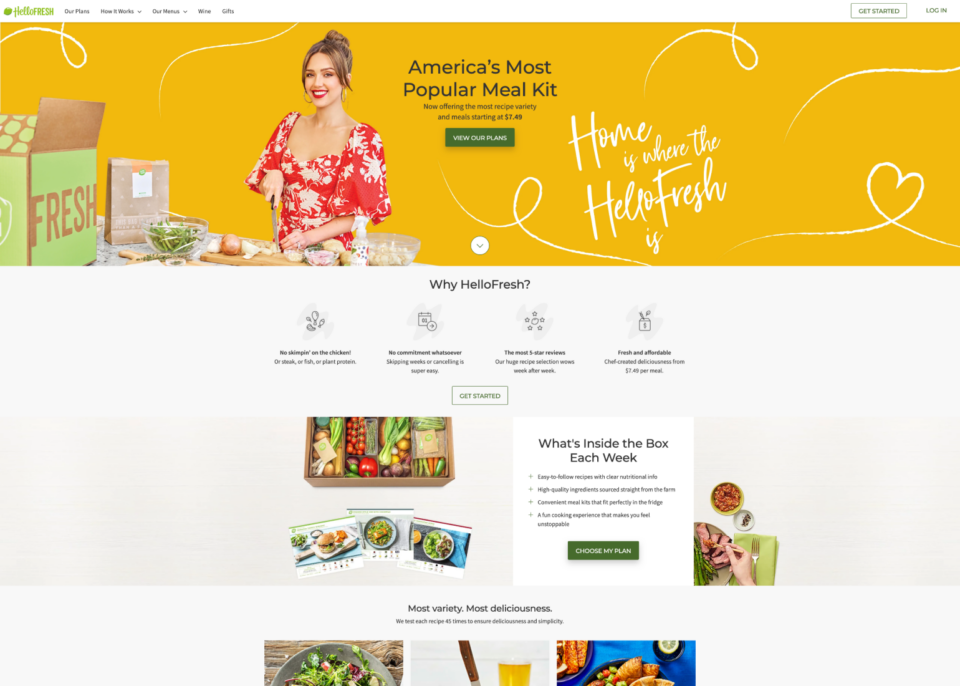

What you can steal:
- Value-rich headline: “Most variety, Most deliciousness” clarifies the value from the get-go.
- Succinct summary: Differentiators like high protein, lack of commitment, reviews, freshness, and affordability are listed.
- Vibrant visual continuity: The signature “HelloFresh” lime green is accented by bold red and yellow.
- Social proof: If you’re a Jessica Alba fan, you’re likely listening.
- Clarifies the promise: This page answers a common curiosity: “What’s inside the box each week?”
None of these email marketing landing page examples are perfect in every respect, but it’s interesting to see how top brands apply unique spins to offer page best practices.
Add landing pages to your campaign with Twilio SendGrid
Want to get started with a landing page to complement your email marketing campaign? Sign up for a free account to get started—no credit card required.
With Twilio SendGrid, you’ll create and test marketing campaigns and access ready-to-use templates for email marketing messages and email capture landing pages. Intuitive tools make calculating email return on investment and boosting conversion rates almost effortless.
Related Posts
Related Resources
Twilio Docs
From APIs to SDKs to sample apps
API reference documentation, SDKs, helper libraries, quickstarts, and tutorials for your language and platform.
Resource Center
The latest ebooks, industry reports, and webinars
Learn from customer engagement experts to improve your own communication.
Ahoy
Twilio's developer community hub
Best practices, code samples, and inspiration to build communications and digital engagement experiences.


