Send With Confidence
Partner with the email service trusted by developers and marketers for time-savings, scalability, and delivery expertise.


Time to read: 14 minutes
Looking for the best free email newsletter templates? You've come to the right place.
Email newsletters are one of the most engaging tools in a marketer’s toolkit.
Think about it. How many email newsletters do you receive daily, weekly, or monthly from the brands you follow? That’s a lot, right?
Email newsletters are one of the most unique forms of marketing because your customers opt-in willingly.
Your customers never asked for your pay-per-click (PPC) ads, sponsored posts, or cold calls (whether they like them or not), but they did ask for your email newsletters when they hit the “Subscribe” button.
Then again, just because your customers asked to receive your email newsletters doesn’t mean they’re going to stick around forever. That's why you have to deliver high-quality, valuable content that keeps them hooked and satisfied—not to mention subscribed.
And that’s easier said than done.
Fortunately, we have just the thing to help: free email newsletter templates.
Our 16 free email newsletter templates will help keep your designs fresh and open-worthy. Below, we’ll walk you through how to create your own email newsletter template and start sending emails your subscribers can’t wait to open.
An email newsletter template is a pre-designed framework that helps you efficiently create consistent emails. Most weekly or monthly emails will follow a similar formatting, style, and structure—a template helps you keep that flow issue-to-issue.
Email newsletter templates should be flexible and user-friendly. Marketers without extensive design experience should be able to use them to build professional-looking campaigns in no time.
Email newsletter templates are typically built using HTML and CSS. These templates can be imported into email service providers (ESPs) like Twilio SendGrid, where you can use our visual editors (or code editor) to drag and drop elements to fine-tune it to your liking.
Some newsletter templates will be simple informational layouts, while others will have more complex promotional designs. You'll have to explore your options and see which design most fits your vibe.
While you're fully capable of creating your own newsletter template (our editor makes it super-duper simple), it can often be easier and faster to get going with a template. If anything, it'll give you formatting ideas and a clean design to present your information.
Here are a few reasons you should use a free email newsletter template when building your campaigns:
Consistency: Templates provide a consistent layout for your emails, which helps in building brand recognition and trust among your subscribers. Every email looks polished and familiar.
Efficiency: Using a template speeds up the process of creating emails. Instead of starting from scratch each time, you can focus on updating the content, leading to more productive and streamlined workflow.
Responsiveness: Most email newsletter templates are designed to be responsive (ours are), meaning they automatically adjust their layout based on the device on which they are viewed. This guarantees that your email looks great whether it's opened on a desktop, tablet, or smartphone.
Customization: Templates serve as a starting point that can be easily customized to fit your specific needs. You can modify everything from the color scheme and images to the text and links, making each email feel personal and tailored to your audience.
Effectiveness: Digital design experts built these templates for aesthetics and functionality. They are structured to guide readers through your message and towards desired actions—be it reading a blog post, signing up for an event, or making a purchase.
Creating an email newsletter template is easy with the right tools. While tools like Photoshop, Illustrator, and InDesign will give you complete flexibility and freedom with your templates, those can be overkill for anyone without trained design skills.
If you’re looking to create your first email newsletter template (and you're not a design pro), we suggest using your email service provider’s (ESP) built-in template-building tools. You can sign up for Twilio SendGrid for free and play around with our editor.
It offers you 3 different ways to create email templates:
A great way to build unique emails is to download a free email newsletter template and edit it to make it your own. For example, you can choose any of our free email templates, download the HTML, import it into your editor, and edit all the elements to be exactly what you need.
Swap out the logo, adjust the colors, insert it in the hyperlinks, and bada bing, bada boom—you’re ready to go with your brand-new email newsletter template.
The best way to send an email newsletter is through an email service provider (ESP). An ESP, like Twilio SendGrid, can set you up with everything you need to send engaging email campaigns at scale.
All you need to do is upload or build your email template, import your email list, design your specific campaign, and press the "Send" button—it’s that simple.
Once your campaign is live, you’ll get access to real-time data on opens, clicks, and more to inspire and inform future campaigns.
Most email newsletters contain a few standard elements. We’ll cover those in just a second, but feel free to be creative and unique with your campaigns.
While your email newsletter will need to include a few basics, the rest is up to your brand, style, and vision.
As for what needs to be in every email newsletter, here are a few elements:
Beyond that, you’re free to be creative and have fun.
Here are a few popular ideas to get your brain juices flowing, but don’t limit yourself to these:
Building a template from scratch can be hard, even if you already know what you want to include. Sometimes, it’s better to start with an existing template and modify it for your needs.
Below, we list all our available email newsletter templates and give pointers on how you can use them. Just click the links provided, and you'll go to a page where you can easily download the template. Here’s how to do it:
All the designs in our free template gallery are fully responsive, meaning your customer will have the same experience, whether they’re reading the email on their mobile device, tablet, or desktop.
While our business newsletter templates use a more professional, rigid look, you’ll still find them fresh and vibrant. Feel free to play with these templates to make them more or less formal to match your brand—a splash of color here or a thinning of the margins there can make a big difference in your presentation.
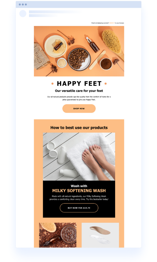
The ecommerce newsletter email template provides a simple, clean email for spotlighting your products. It gives you a hero image box front and center to feature your product and supporting boxes to add complementary products or links to relevant blog posts.
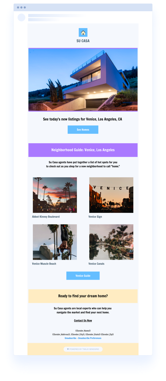
Real estate is all about the imagery, and that’s why this real estate newsletter email template gives adequate space to highlight multiple images. Pick your most eye-catching photo for the top spot, and then sprinkle in your others in the boxes below. Plus, a simple call to action (CTA) doesn’t take attention away from the images while also nudging your subscribers on what to do next.
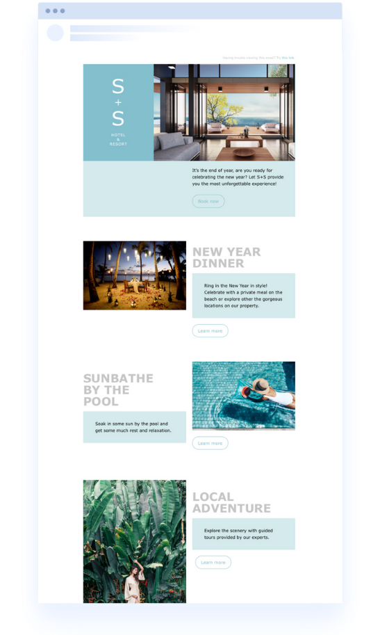
There are always things to do at your hotel or resort, and this hotel newsletter email template gives the right balance between white space and content blocks to highlight it all. Keep it minimalist and image-rich for the most modern and effective approach.
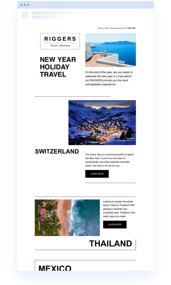
The best travel newsletters use clever copy and beautiful images to tell nomad-inspiring stories. Take advantage of the big, bold text in this travel newsletter email template to highlight your destinations, then capitalize on the short, clever copy to turn eyeballs into conversions.
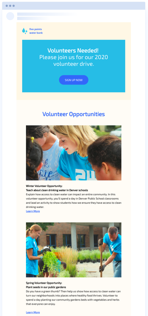
Nonprofits are all about people and humanity, and this free nonprofit email newsletter template gives you the perfect space to spotlight volunteer opportunities or upcoming events with powerful photography. There’s adequate space below each section to explain the events in detail, and then there’s a nonobtrusive CTA to help your subscribers take action.
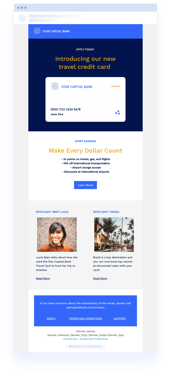
Banks want to communicate trust, and this contemporary, professional template does just that. It’s the perfect bank or financial institution newsletter email template that delivers your message while respecting your subscribers’ time.
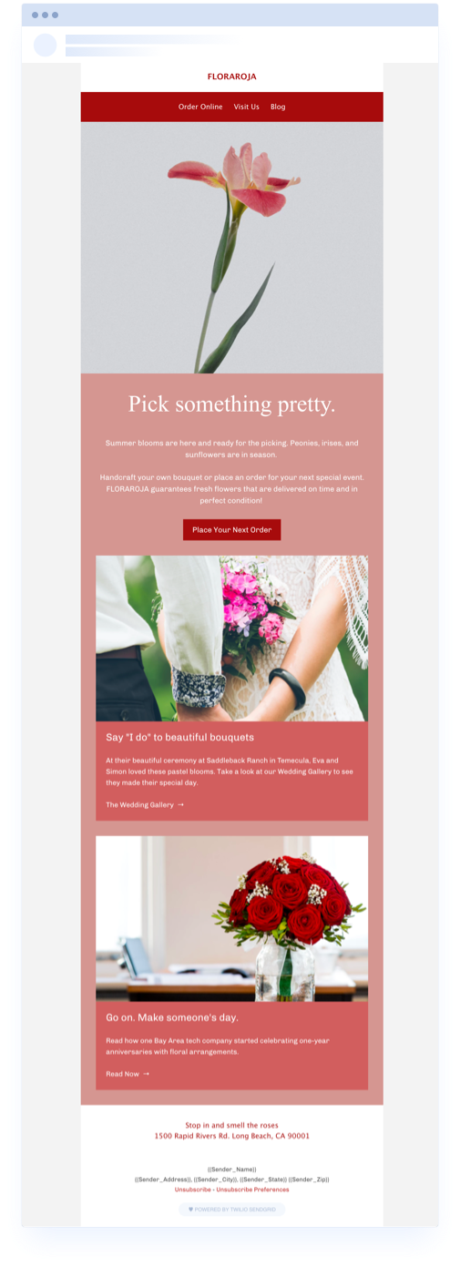
Whether you own a local floral shop or a yoga studio, this simple, elegant newsletter design lets you feature your latest and greatest content while prioritizing your brand’s voice and style. Plus, you can add more content blocks to the small business email newsletter template if you have more content to feature—just try not to go overboard.
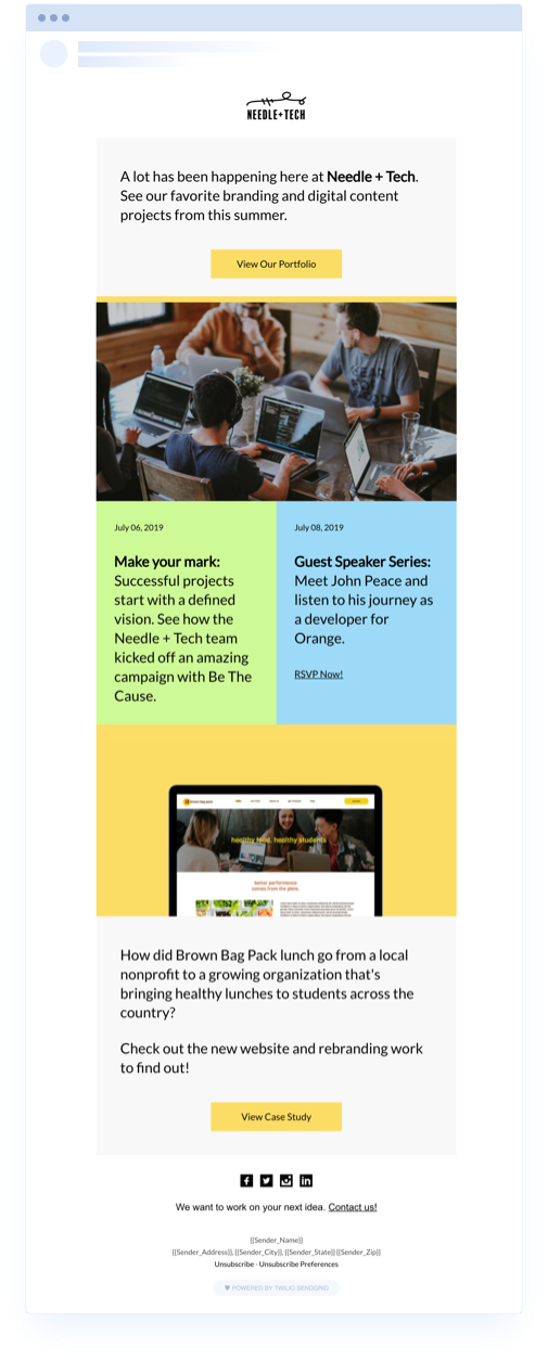
Your B2B customers want newsletters, too, which is a great opportunity for you to feature upcoming webinars, product updates, and customer testimonials. The B2B newsletter email template keeps things bold by categorizing based on color. But you can also tone it down and make the background white or embrace the style and swap out your brand colors.
Frequency newsletter templates focus on newsletters sent at regular intervals. Whether that's every week or every month, these newsletters give you the right amount of space to feature your content without overwhelming your customers.
Consider your engagement to determine which cadence is right for you. If you’re sending a weekly newsletter but struggling to get opens and clicks, consider pushing it to once a month. This will allow you to feature the best-of-the-best content and still keep your customers regularly engaged.
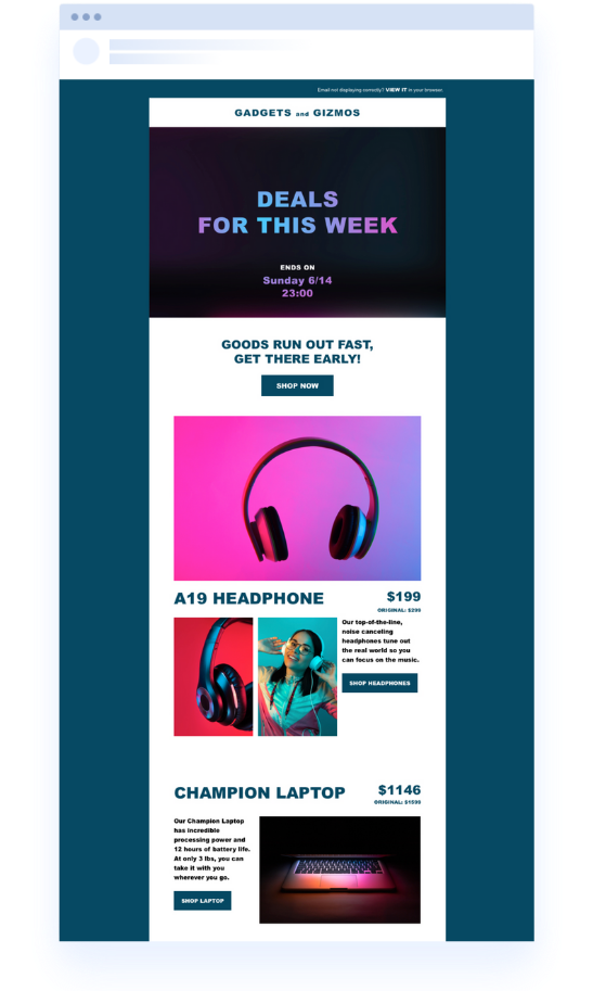
The weekly newsletter email template is an image-heavy template that lets you speak to your customers with photos instead of words. It includes spots for big hero images, short captions, and small CTA buttons. If your product is the hero of your brand, try using this newsletter template on a weekly basis to put it front and center.
If a newsletter every week seems a bit too much (for both you and your customers), slow your cadence down to once a month. This monthly newsletter email template uses a fun collection of different-sized squares to feature content in a more collage-like style. You can even swap out the black-and-white background for something more on-brand.
Each holiday only comes around once a year, which means you need to do your best to capitalize on the moment. These holiday-focused newsletters will help you do that by capturing the feeling of the day with specific colors and themes. Give them a try to ensure your customers know this email isn’t their typical weekly or monthly newsletter—it’s a special holiday promo.
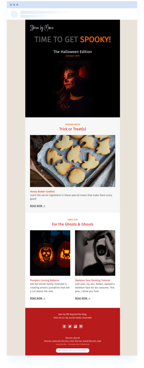
Embrace the holiday spirit with a template that’s the right balance between Halloween nerd and customer-centric. You can use this Halloween blog email template to spotlight your annual deals or have fun with it by mentioning Halloween events and spooky-good recipes. And, with a slight shift of the colors and fonts, this template is perfect for repurposing for Thanksgiving, too.
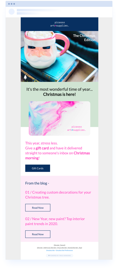
This retail holiday newsletter template lets you focus the upper half of your email on a single focal point and CTA, while the second half can include links to recent blog posts or upcoming events. You can also switch up the colors for however you need to target the right holiday season—slight shades of green and white can make this a Christmas newsletter, while red and blue could easily make it a 4th of July email.
Intention-based newsletters are all about identifying customer behaviors that show purchase intent. For example, customers Googling certain keywords or visiting your product pages show that they’re considering making a purchase.
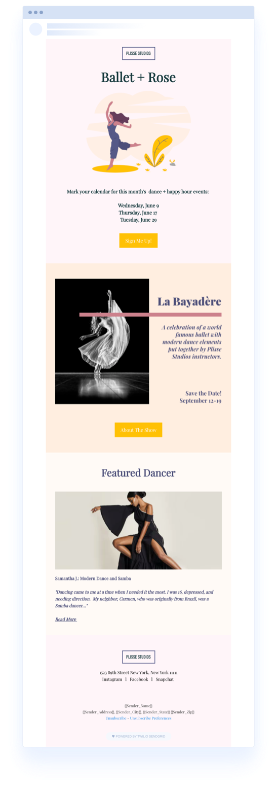
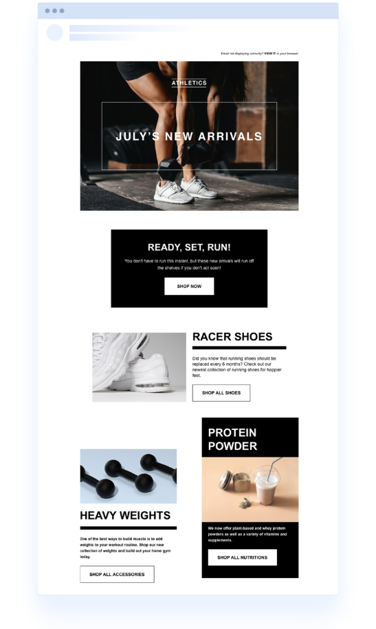
This fitness newsletter email template can easily accommodate a gym, yoga studio, or even a smoothie shop. By highlighting your high-priority CTA at the very top and backing it up with a photo or illustration, it does most of the talking for you.
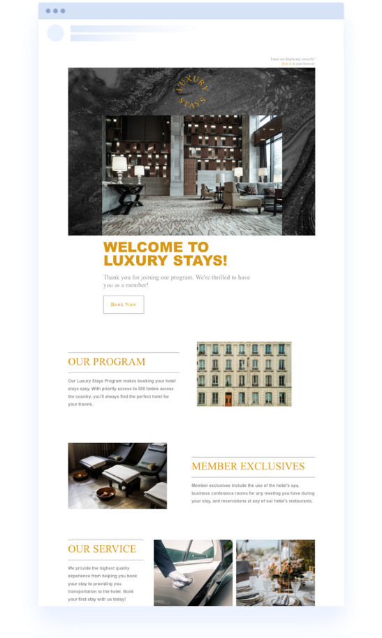
Now that your customers have shown interest in your brand by subscribing to your newsletters, it’s time to make a good first impression. This welcome newsletter email template will help you set the tone for all future emails, and it’ll help determine whether your recipients stay subscribed or hit the road early.
Seasons come and seasons go, just like your products and promotions. By using a seasonal newsletter to introduce a new season and new product lines to your customers, you help set expectations for the next 2–3 months.
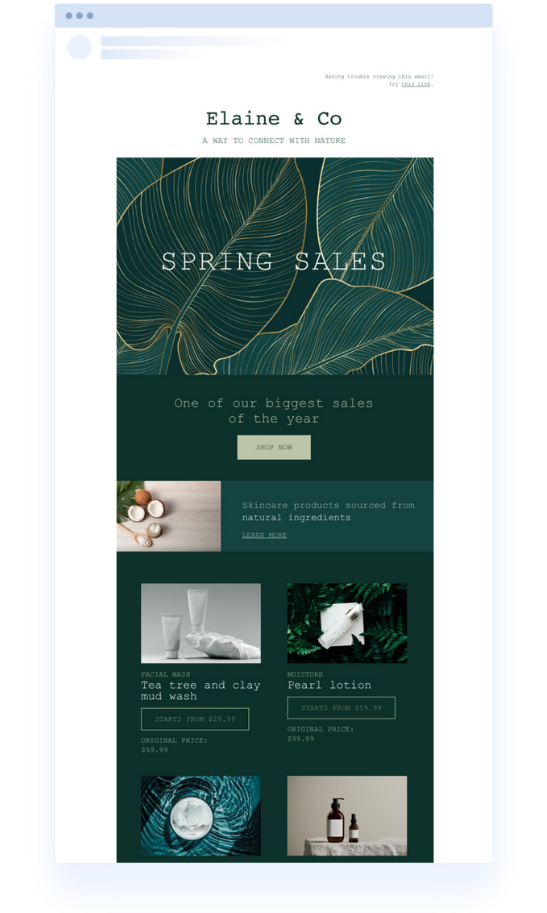
Capture the energy of the changing of seasons and new products with this seasonal newsletter promotion template. Find colors that help you to both stay on-brand and be creative.
Your email newsletter should communicate your brand’s unique style. While we offer free templates to get your creative juices flowing, it’s up to you to swap out the colors and play with the organization to make it one of a kind to your business.
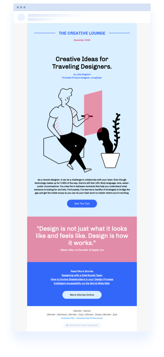
The featured content email newsletter template is the perfect weekly or monthly email to send when you want to feature a single piece of content. After all, while it’s great to give your customers choices of content, from time to time, it’s OK to give them a single CTA.
Well-designed email newsletters boost engagement, opens rates, and conversions. Poorly designed emails do the opposite. But what makes an email newsletter design good, and what contributes to making one bad?
Good questions. We have answers.
Clarity: Good design communicates the message clearly and without unnecessary clutter.
Hierarchy: A well-designed email guides the reader through the content in a flowing, logical order. It uses headers, subheaders, bullet points, and images strategically to create a hierarchy that makes sense.
Responsive: Good design must be responsive. It should look and function well across all devices, adapting layout and content to fit different screen sizes.
Branding: Good newsletters reflect the brand’s identity through consistent use of colors, fonts, and tone.
Imagery: Good design incorporates graphics and photos that support the content and are aligned with your brand's aesthetic.
Typography: Text should be easy to read, with font sizes, colors, and spacing that make scanning and understanding content straightforward.
Effective calls to action: Good designs use clear, compelling calls to action (CTAs) that are easy to find and understand.
Overcrowded content: Too much text or too many images can overwhelm readers, making the newsletter hard to navigate.
Inconsistent branding: Inconsistencies in colors, fonts, and overall style can confuse subscribers and dilute brand identity.
Slow loading times: Heavy use of large images or complex HTML can slow down email loading times.
Lack of personalization: Generic designs that don't cater to the audience’s preferences or behaviors can come off as impersonal and disengaging.
Whether you’re planning a weekly promotion or a seasonal customer newsletter, Twilio SendGrid email newsletter templates take the pressure off and let you focus on the content instead of the design.
Find an email newsletter template you love, download it, and get started with your brand-new newsletter in minutes. Plus, Twilio SendGrid’s email editor gives you complete control of how you tailor the template for your needs. Use our drag & drop editing tools or manipulate the code to position email elements exactly how and where you want them to be.
Newsletter templates are just the beginning. Find email templates for your welcome emails, product announcements, purchase receipts, password resets, and more. Check out the free template gallery to find the perfect responsive design for every occasion.
Need help sending email campaigns? Sign up for a free Twilio SendGrid account and start sending.
Partner with the email service trusted by developers and marketers for time-savings, scalability, and delivery expertise.