Send With Confidence
Partner with the email service trusted by developers and marketers for time-savings, scalability, and delivery expertise.


Time to read: 6 minutes
From the customer email you review mid-flight to the email you write while you’re waiting in line at Starbucks, we’re all doing much more on our phones. In fact, SendGrid found that a majority of emails (55.6%) were opened via a mobile device.
As more and more of our communications occur on-the-go, it’s important to send emails that look great across all devices. Here are 10 tips to help you optimize your emails for mobile devices.
The first step to optimizing your email for mobile is to understand how your audience is viewing your email. SendGrid found that the majority of email content in the U.S. is being viewed via Gmail (42.1%) and on iPhones. Knowing the device and the email service provider your recipients use to view your email helps inform you on how to best develop your emails.
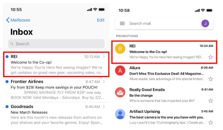
Notice below how differently the Apple Mail app (left) and Gmail app (right) display the preview text for the same email. The Apple Mail app provides twice the amount of space for the preview text. Knowing how your recipients are viewing your email helps you determine, for example, how many words to include in your preview text.

With such little space on mobile to convince your recipients to open your email, it’s important to leverage all available real estate. This includes not only the subject line, but also the from address, and preview text.
The recommended size for emails on desktop is 600px, but this is too wide for most mobile devices. To save your recipients from finger pinching your emails, incorporate media queries in your CSS. Media queries allow you to stylize your template for specific devices so that your template can adapt to the height and width of different devices. A media query for a mobile screen should include a max-width of 480px.
Check out our blog post, 10 Tips for Designing and Developing Emails, for more information on email development.
Two columns of text on a mobile device tends to be too dense to easily read. If your email is on the text-heavier side, we recommend sticking to a single column.
If your images are small enough, it can work well in a two-column design, but be aware that multi-columns are often much trickier to render correctly across platforms and devices than a single column layout.
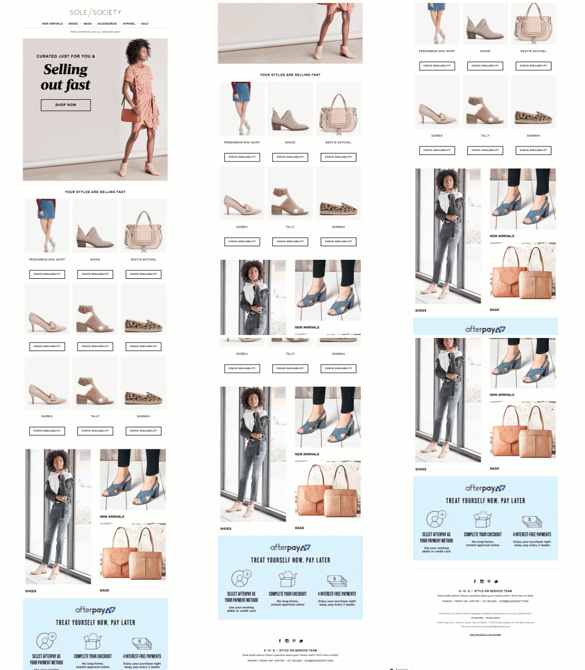
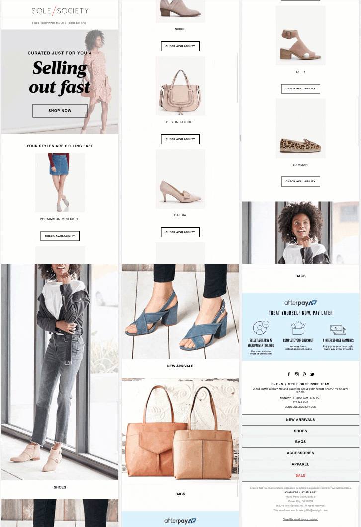
Take a look at the email below. The version on the left is for desktop and uses a multi-column layout. The version on the right is for mobile and utilizes a single-column layout. The single column layout makes it easy to view and scroll through the variety of products.


Retina images, images that are doubled in size for clarity on 4k or retina screens, are ideal to use for logos and important visuals. But, in image-heavy emails, too many high-resolution images could cause a slow download time, especially over a poor internet connection. If an email doesn’t load quickly enough, you risk losing the attention of your audience, so be careful of how many retina images you include in your emails.
Some email service providers (e.g. Gmail iPhone browser and Gmail IOS app) will block images by default, so be sure to include ALT tags to help inform the reader of what’s being viewed. You can even style the ALT text to give it a designed feel when the images don’t load.
Don’t force us to break out the reading glasses. Use font sizes that are on the larger size, and avoid cursive fonts that are difficult to skim read. Additionally, be aware of font changes across different devices. For example, the font, Comic Sans, is not supported on mobile devices.
Use white space to your advantage. Break up copy with bullets, calls-to-action (CTAs), and images to improve the readability of the email. Remember that your recipients are skimming emails, not hanging onto every word. Design your mobile emails so that they are skimmable, and avoid copy-heavy emails when possible.
Jason Walker does an excellent job in his blog post, Whitespace and Harmonious Rhythm in Design, explaining how you can use a modular scale to help create balance in your website design. This scale can also be applied to your email design if you’re looking to find the perfect ratio of white space to content.
When creating CTAs for your mobile templates, keep your thumbs in mind. The CTA needs to be wide enough to easily click with your thumb (and not accidentally click on something else).
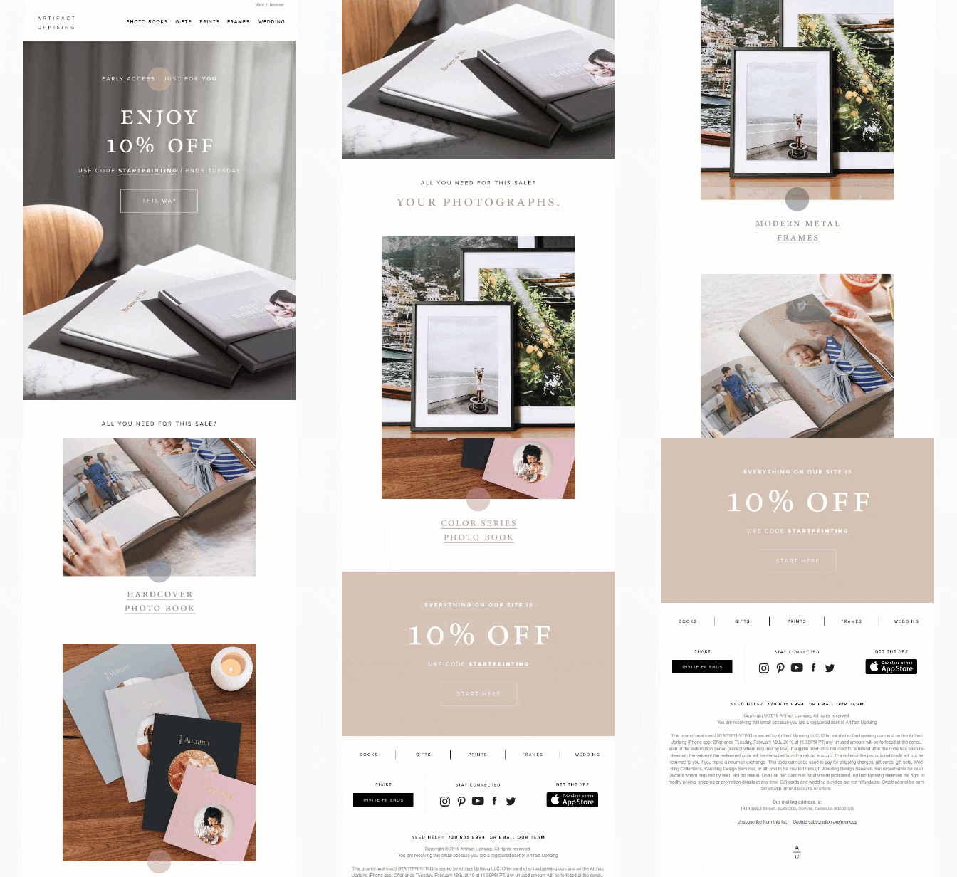
If your email is on the longer side, try placing a CTA at both the top and the bottom of the email. This way your recipient doesn’t have to spend time scrolling up to the CTA once they’ve reached the bottom of the email. In the example below, Artifact Uprising sandwiches their 3 offerings with the CTA at the top and the bottom. Nicely done, Artifact.

If you’re interested in directing your recipients to your app instead of your website in your mobile emails, you can add a universal link that will send your recipients directly to the App Store. (Heads up this requires coding!)
You’ve put all this effort into optimizing your email for mobile so don’t ruin it by sending your subscribers to a landing page that is not mobile friendly. Your landing page should look as good (or better) on a phone as it does on a standard browser. This means following some of the same rules above regarding page width plus keeping the content brief and easy to digest for subscribers on the go.
Test your email across different devices and providers through tools like Email on Acid and Litmus. This will give you the peace of mind that your emails are looking great in every inbox.
When designing your mobile emails, keep your personal user experience in mind. If your email isn’t something you would read or scroll through in the 30 seconds you have while filling up your gas tank, then take a look at what you could change to make it more appealing. Reference the 10 tips above, and for more general email design tips, look to The Experts Guide for Email Design.
If you’re not quite ready to tackle developing a mobile responsive email template, not to worry, SendGrid has plenty of responsive templates that you can adapt for your brand. Sign up for a free Marketing Campaigns account to test out our email marketing templates.

Partner with the email service trusted by developers and marketers for time-savings, scalability, and delivery expertise.