How to Send Confirmation Emails (Examples & Templates)
Time to read: 8 minutes
The confirmation email is one of the most important messages you’ll ever send to your recipients. Whether you’re confirming a purchase or validating a signup, these emails must make it to your customers’ inboxes.
Don’t let it hurt your feelings, but even the most straightforward confirmation notification has a higher open rate than your most creative newsletters. These transactional emails receive incredibly high engagement rates. Why? Because they usually have greater deliverability, more personalized and actionable content, and were initiated by the user in one way or another.
But not every confirmation email is made equal. A few get it right and deliver an incredible, on-brand customer experience, while many others get by with the bare minimum. If you want to join the few and provide top-notch communications to your recipients with every email you send, then keep reading.
This post will give you a complete rundown of confirmation emails. We’ll talk through best practices and even share a few of our favorite examples and free templates. But first: what is a confirmation email?
What is a confirmation email?
A confirmation email is a transactional email you automatically send to your recipients to validate an action they’ve taken. Here are a few common types of confirmation emails:
- Signup or subscription confirmation email: Sent when a visitor to your website signs up for an event, subscribes to your newsletter, or registers for a webinar
- Order or purchase confirmation email: Sent after a customer makes a purchase to verify the details of their order. It serves as a record and receipt for your customers as well as confirmation that you’ve received their order.
- Shipping confirmation email: Lets your customers know when an item has been shipped and when they can expect to receive it
- Cancellation confirmation emails: Confirms when a customer cancels a subscription, service, or order
If a visitor comes to your site and makes a purchase, they anticipate an email confirmation letting them know you received the order and when the item should arrive. Fail to deliver, and your recipients could be stuck in a land of expectation limbo—not good for you or your business’ customer support team.
Plus, your confirmation emails are usually the first email experience your recipients have with you. Make a good first impression by putting some time and effort into your confirmation email design.
How to send confirmation emails
Sending confirmation emails will look different depending on your email service providers, but here's the simple step-by-step way to send them with SendGrid:
1. Sign Up for a SendGrid Account:
If you don’t already have a SendGrid account, visit the SendGrid website and sign up for a free or paid account.
2. Set Up Sender Authentication:
Authenticate your domain to improve deliverability and ensure your emails are recognized as legitimate by ISPs. Follow SendGrid’s authentication guide to set up Sender Policy Framework (SPF), DomainKeys Identified Mail (DKIM), and Domain-based Message Authentication, Reporting & Conformance (DMARC).
3. Create an Email Template:
Go to the “Templates” section in the SendGrid dashboard.
Click on “Create New Template” and choose “Transactional Template.”
Design your confirmation email using the drag-and-drop editor or by coding your own HTML. Include placeholders for personalized content such as the recipient’s name, order number, and other relevant details.
Save and name your template for easy reference.
4. Set Up an API Key:
Navigate to the “Settings” section and select “API Keys.”
Click on “Create API Key” and give it a name (e.g., “Confirmation Emails”).
Choose the appropriate permissions for your key (Full Access, Restricted Access, or Read Access) and click “Create & View.”
Copy the generated API key for use in your application.
5. Integrate SendGrid with Your Application:
Use SendGrid’s API or SMTP Relay to integrate with your application. If you’re using the API, install the SendGrid client library for your programming language (e.g., Node.js, Python, PHP).
Configure your application to send confirmation emails by including the API key and the template ID from the email template you created.
6. Send Confirmation Emails:
In your application’s code, set up the logic to trigger confirmation emails when a user completes a specific action (e.g., making a purchase or signing up).
Use the SendGrid API to send an email, filling in the placeholders in your template with the appropriate data (e.g., recipient’s name, order details).
Confirmation email design best practices
There isn’t one right way to design confirmation emails, but there are a few best practices you should follow:
- Keep it short and simple. Remember, your confirmation message has one primary purpose: to confirm the action your recipient has taken. The recipient shouldn’t need to scroll through your email or look closely to find the essential information they’re looking for—make the confirmation details bold, clear, and front and center. Don’t distract your recipients with unrelated calls to action (CTAs).
- Inject your brand personality. Add your brand logos, colors, and unique voice to turn a boring ol’ transactional email into another stellar customer touchpoint. If your brand voice is less “Thanks for signing up for the event” and more “This event will change your life forever!” make sure that’s reflected in your confirmation emails.
- Make it mobile-friendly. More than half of all emails are opened on a mobile device, so make sure you prioritize your mobile email design.
- Be creative—but not too creative. While it can be fun to spice up your confirmation emails, remember to not go overboard and stick to the relevant information. Email deliverability expert Will Boyd recommends: “Avoid adding marketing messages into your transactional emails. These can cause you problems because mailbox providers scan your content and may feel like your message is more on the marketing side—and they are more likely to mark that message as spam.”
- State the content in the subject line. Confirmation email subject lines should be specific and get straight to the point so the recipient knows exactly what the email is about (and can easily find it in their inbox when they need to reference it).
The best email confirmation examples
Now that we know what to look for, let’s take a glance at some brands that do it right. Here are a few examples of the best confirmation emails in my inbox.
Foodee lunch order confirmation
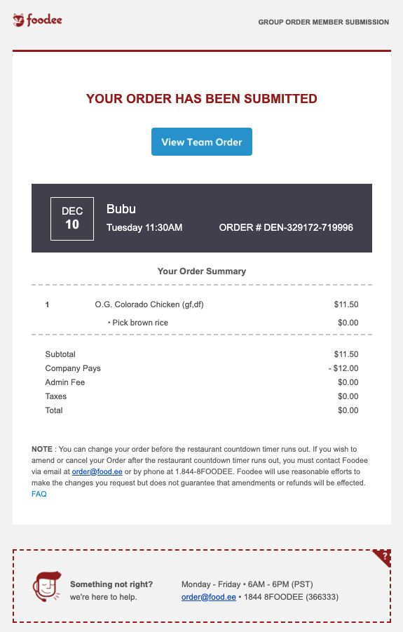

I can’t tell you how many times I have to jump into my inbox to find my Foodee confirmation email so I can remember what I ordered for lunch. It’s embarrassing. But this email delivers exactly what I need—delivery date and time, the restaurant I ordered from, order number, and which meal I chose. The email also contains contact information so I can reach out to Foodee if my order is late or incorrect.
Myprotein shipping confirmation
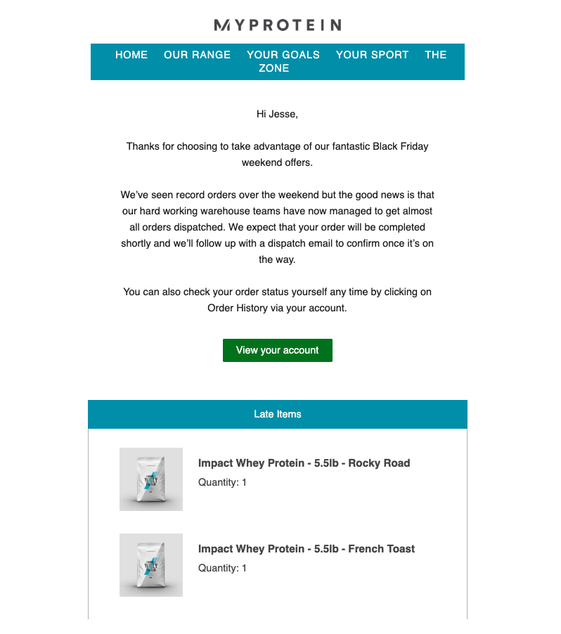

During their Black Friday sale, Myprotein updated their transactional emails to let customers know that they were experiencing a record-high number of orders. This little post-purchase blurb was reassuring when I realized my order hadn’t shipped the following day. Use your ecommerce confirmation emails to communicate any necessary information with your customers—this will save you from sending an extra email to all your recipients.
Uber ride receipt
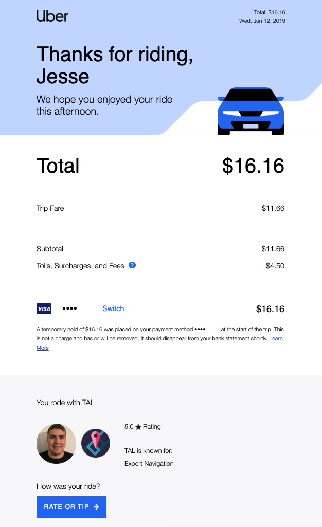

Uber’s confirmation email is a great example of how you can inject personality into your transactional emails. In a quick snapshot view, you can see how much you spent, who you rode with, and even a map of your trip. These simple receipts act as a fun digital journal of all your Uber rides and the memories associated with them (instead of just a few numbers reminding you how much you paid).
Free confirmation email templates
Wondering how to send confirmation emails that deliver everything your recipients need? Don’t worry—Twilio SendGrid has your back! We have a library of free email marketing templates, including multiple confirmation email templates.
All of these templates are responsive, downloadable, and 100% free. Just find a template you like, click “Download Template,” enter your contact information, and you’ll receive the HTML code in your inbox.
If you need help getting started, check out the webinar below, where our team of email experts show you the step-by-step email design process. You’ll learn how our designers go about creating stellar emails, and then you’ll see firsthand how a marketer can download these templates and tweak them for their unique purposes. Then, keep reading to see a few of our favorite confirmation email templates from the library.
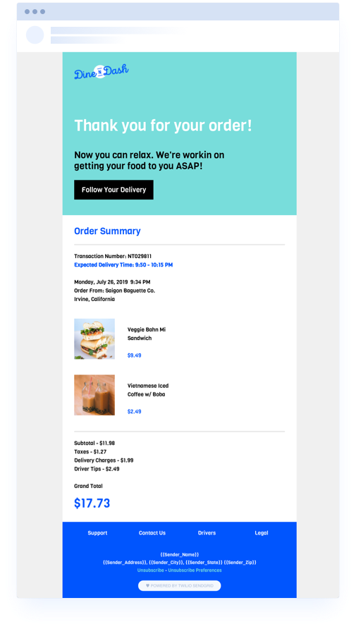

This order confirmation email template adds a bit of color and organization for a quick, scannable email. It provides just the right amount of detail to make your confirmation email convenient but not overwhelming. Just swap in your logo, font, brand colors, and voilà—you now have a sleek, smooth transactional message for your customers or new subscribers.
Download confirmation email template
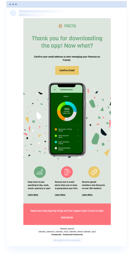

While this download confirmation email template was designed for app downloads, it can be customized for any confirmation purpose. It has a clear CTA button at the top, encouraging new customers to confirm their email so they can begin using the app. Plus, it also provides links to additional resources to get new users up to speed.
Signup confirmation email template
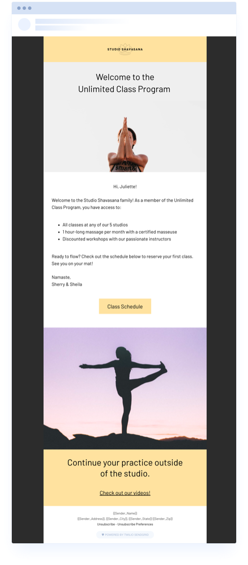

Use this free signup confirmation email template to welcome new users who sign up for a class, subscription, or newsletter. The template provides a structure for strong imagery while also including generous white space for all your messaging needs. For more welcome emails, check out these 11 examples for inspiration.
Registration confirmation email template
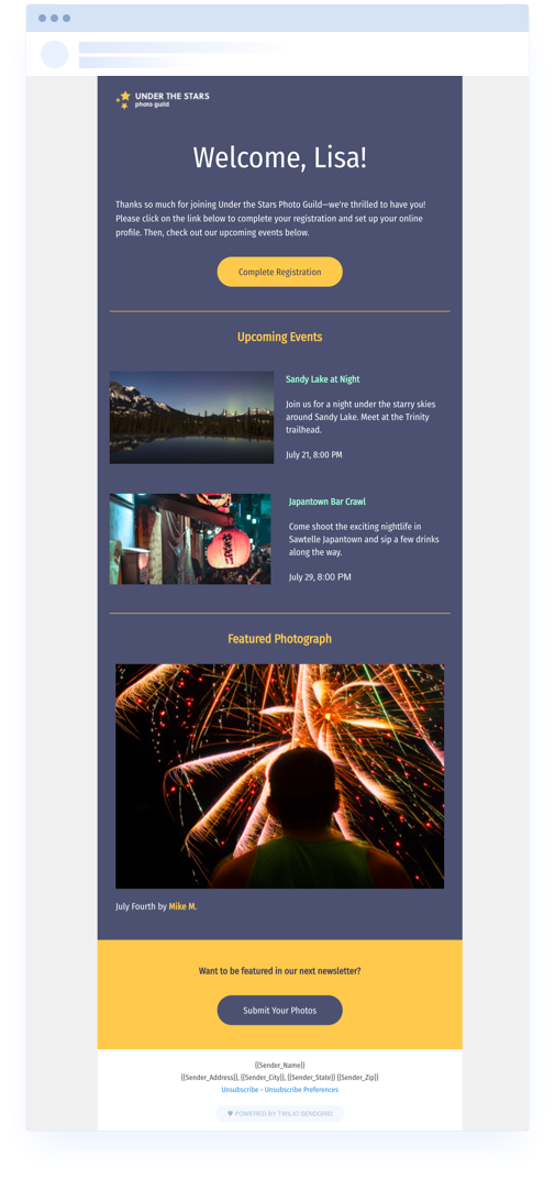

Whether you’re hosting a conference or a webinar, use this registration confirmation email template to validate your attendee’s email address and get them to complete their profile. It’s the perfect method for double opt-in. This template also allows you to promote your upcoming events, related products, or relevant blog posts for an organic upsell or cross-sell opportunity.
Send effective confirmation emails with Twilio SendGrid
And that’s confirmation emails in a nutshell. Just because you’re sending transactional emails doesn’t mean they need to be bland and boring. Spice things up a bit, have some fun, and let your brand’s personality shine.
If you want to create fantastic emails without hiring an expensive designer or buying pricey templates, check out our webinar: Email Redesign: A Fresh Look at How to Create Simple, Stunning Emails. It’ll show you everything you need to know to create swoon-worthy confirmation email campaigns!
Plus, learn how you can use Twilio SendGrid’s email automation tools to streamline your confirmation emails, and try it for free today.


Related Posts
Related Resources
Twilio Docs
From APIs to SDKs to sample apps
API reference documentation, SDKs, helper libraries, quickstarts, and tutorials for your language and platform.
Resource Center
The latest ebooks, industry reports, and webinars
Learn from customer engagement experts to improve your own communication.
Ahoy
Twilio's developer community hub
Best practices, code samples, and inspiration to build communications and digital engagement experiences.


